28.5.09

thinking about chairs


thinking about chairs
Originally uploaded by third bird
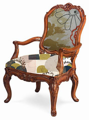
this is a digital mock up of an idea i have of upholstering a miss match of old chairs with my designs. the problem is finding the right chairs!!!

20.5.09

pattern collage

the main focus of my research into the big wide world of collecting is how collecting and, in particular, the objects in my personal collections, inform my artwork and design process. is the act of gathering, grouping and arranging an object for display in the home similar to the process of gathering, grouping and arranging pieces of paper and ephemeral for a collage and perhaps, the random placement of motifs, shape and colour printed onto cloth?
because collage is an important part of my design process, i am aiming to incorporate the act of collecting into a series of collages for my final body of work at the end of the year. to complement this, i will also be approaching my printing in a similar way. working with the idea of random placement and layering to create a collage of prints onto cloth.

below is a sample of different patterns and shapes layered together to create a "collage" composition.


16.5.09

texture and shape

i was playing around this week with ways of generating texture. i always seem to forget about the really basic fun ways of screen printing, like wax resist!
for these i used a crayon to make a rubbing (directly onto the screen) of my wallpaper texture. i then used a hand cut-out stencil to layer the blue shapes over the print.


8.5.09

first semester crit

here are some pictures of my work on display for our workshop crits yesterday that i talked about in my previous post. it really is an exciting thing to gather everything up from our confined studio spaces and hang it all on the wall to be able to stand back and have a look at what is going on. you really get a sense of what is working together and what isn't.

i was really happy to see how the figurative and non-figurative shapes work together. i felt there was a nice flow throughout the body of work.


below are some more samples using the shapes from my jelly mould collection. this time i left the textured elements out and worked with introducing more bold, semi-figurative shapes.


digital design process

yesterday at uni i had my first semester crit. this is when we get the opportunity to pin all our work up, get it away from our studio spaces and talk about it to the entire workshop and get feedback.
i'm a bit of a retard when it comes to talking in front of groups of people and manage to get myself all worked up for nothing, i talk at a hundred miles an hour and even get the shaky hand or leg or both at the same time. this is totally ridiculous considering it is only for 10 minutes in front of people i am completely comfortable around.

anyway, besides this slightly painful side of yesterday's crit process, i am quite excited about where i am up to with my design process and really enjoyed getting feedback. there were two ideas in particular that were very exciting and will experiment with over the next few weeks but firstly, i would like to share a little bit of the design process of a some of my latest work.

because i am using my collections as a starting point to develop pattern for printed cloth, i thought it might be a useful experiment to use photoshop filters to simplify shapes directly from an image of the jelly moulds.

below is a detail of one of one of the moulds.


i then used the photoshop filter 'stamp' to simplify the image.


doing the same with another detail photo, changing the colour and layering them together.


in an earlier post i used this same filter on an image of my whole collection and really loved the flower shape of my smallest jelly mould. here i have copied it it randomly onto the top layer.


these are a few quick sketches in my visual diary from looking at the moulds. i am really interested in the relationship of bold shapes when layered with illustrative motifs. i chose the large flowery motif to layer with the image.


finally, this is where i stopped. as a little composition i was really happy with how the shapes were working together and the texture was a nice addition from the very bold, flat imagery that i was printing last year. and of course, the colours...these combinations are from my vintage telephone colourway from earlier post.


AND....these are some samples of this design printed onto cloth.